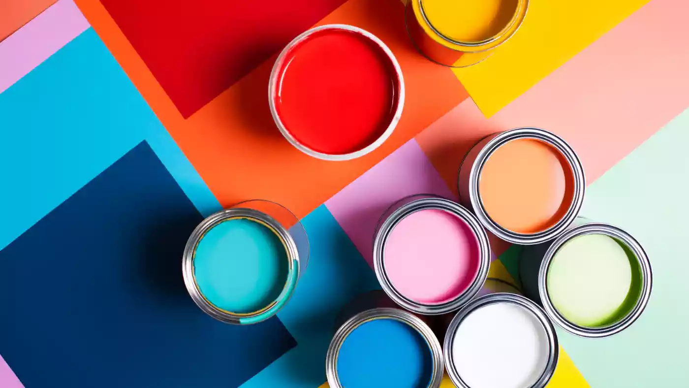
IN the ever-competitive world of marketing, where consumers are bombarded with countless choices everyday, colour has become a powerful tool to influence perception, evoke emotions and establish a strong identity.
Nowadays, colour is no longer a decorative element; it has become integral to how a brand is perceived and remembered. The psychology of colour and its ability to evoke emotional responses is central to why it plays such a critical role in branding.
From food, fashion, healthcare to technology, colour can define the consumer experience, influence purchasing behaviour and ultimately determine the success or failure of a brand.
Colour communicates much more than just aesthetic appeal; it has a profound psychological effect. Each colour triggers different emotions, which can influence decision-making. For instance, the colour red is associated with energy, passion and urgency. This is why many fast-food chains, such as McDonald’s, Chicken Inn, Chicken Slice and KFC, among others, utilise red in their branding — it is about grabbing attention and stimulating appetite. Red’s stimulating effect also conveys excitement and enthusiasm, making it ideal for brands that want to stand out and evoke a sense of immediacy.
On the other hand, blue evokes senses of trust, calm and professionalism. This is why some banks; tech companies and healthcare brands incorporate blue in their logos. Facebook, Econet, IBM, Chelsea FC, Pepsi, among others, all leverage on this colour to project reliability and stability. Blue’s cool tones can also create a sense of serenity, making it an effective choice for brands in the wellness, spa and medical industries, for example Cimas.
In this sense, colour acts as an unconscious cue that helps consumers to align a brand with the feelings they seek to experience or associate with it.
One of the most obvious practical benefits of colour in branding is its ability to foster instant recognition. Brands that use distinctive colours in their logos and marketing materials become easier for consumers to identify. Think about Coca-Cola — its iconic red-and-white colour scheme is universally recognised, often even without the brand name being visible. In the beverage industry, Pepsi has similarly used blue to establish its brand identity, giving it a distinct presence in a crowded market. When you see the blue and red of Pepsi or the red of Coca-Cola, the brands’ identities come to mind automatically.
Colour also helps a brand to stand out among its competitors, especially in industries where the visual landscape is saturated. Take the tech industry, for example, Apple stands out with sleek, minimalist branding in a combination of silver, black and white. The absence of bold colours allows Apple to communicate sophistication and innovation, setting it apart from the often more colourful and chaotic logos of its competitors.
- CCC condemns police conduct over Zipra march
- Vive La difference
- Mr Zimbabwe to hosts Vic Falls Fun Fair
- Vive La difference
Keep Reading
Similarly, in the food industry, colour can be used as a tool for differentiation. American multinational fast-food franchise Subway made a strategic decision to use green in its branding. This is meant to communicate health and freshness — an important message in a market where consumers are increasingly mindful of what they eat.
The use of green contrasts with the red and yellow typically associated with fast-food chains, signalling that it offers a different, more health-conscious option. This choice is not just aesthetic; it reflects the brand’s core values.
More so, purple, often associated with royalty, luxury and creativity, is frequently used by premium brands to signify high-end quality. Twitch, the live-streaming platform, uses purple to represent creativity and fun, aligning with its youthful, energetic audience. In contrast, luxury brands such as Louis Vuitton and Rolex use gold or deep purple to portray wealth and sophistication, reinforcing the exclusivity of their offerings.
While the emotional effects of colour are universal, the cultural significance of colour can vary widely. For example, in Western cultures, white is often associated with purity and peace, which is why it is commonly used in wedding dresses. However, in many Asian cultures, white is linked with mourning and death.
That said, brands that operate globally need to be mindful of cultural nuances when selecting their colour palette. A global brand like McDonald’s takes care to tailor its marketing to different regions, adjusting not only its messaging but sometimes the use of colour to align with local preferences.
The use of colour creates consistency across all marketing materials, helping to establish a unified visual identity. Coca-Cola, Nike and Apple all maintain a consistent use of colour in their advertising, packaging and digital content. This consistency reinforces brand recognition and ensures that consumers associate the colours with specific values, emotions and experiences.
Colour also plays a role in building long-term brand loyalty. Over time, as consumers interact with a brand, the colour palette becomes ingrained in their memory, forming an emotional connection. As brands evolve, keeping their colour palette consistent helps them to maintain a sense of familiarity, which is critical to sustaining customer loyalty.
Colour is not merely a design choice; it is a fundamental part of a brand’s identity. It influences how a brand is perceived, how it differentiates itself from competitors and how consumers feel about it. Brands that use colour strategically can create strong emotional connections with their audience, enhance brand recognition and influence consumer behaviour.
From the red of Coca-Cola to the green of Subway, the colour choices companies make reflect their values, their messaging and their long-term brand strategy. As the visual world continues to evolve, colour will remain a key player in the ongoing effort to stand out, connect with consumers and create lasting brand loyalty. I bow out.
- Cliff Chiduku is the director of marketing, information and public relations at Manicaland State University of Applied Sciences in Mutare. He writes here in his personal capacity. He can be contacted on cchiduku@gmail.com or call/app +263775716517.


